

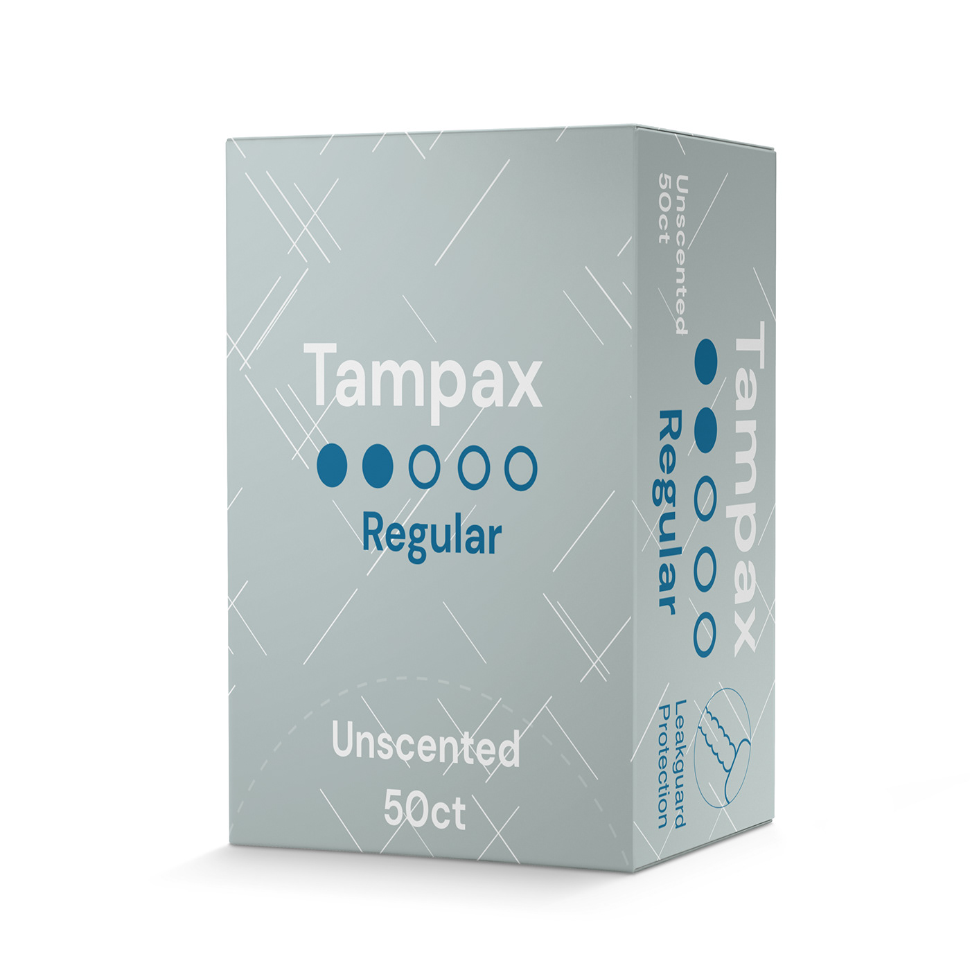
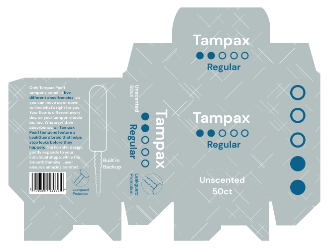
The current design for tampons is significantly over the top and very confusing. The current packaging seen is hyper-feminized with flowers and gender stereotypes. Some people may not even identify as female but still need to use tampons. The goal of this project was to simplify the box to communicate the most important pieces of information. The absorption level is straightforward and uses a series of dots to indicate the level out of five.


